Winton Centre for Risk and Evidence Communication
Project - Communicating uncertainty
We started by developing a framework in which to consider uncertainty, based on previous academic work as well as a review of how people often try to communicate uncertainty (or avoid communicating it) in real life. For a full description of that work, please see Communicating uncertainty about facts, numbers and science.
In summary we suggest that researchers in this field consider:
— Is the uncertainty you are studying about the past/present or about the future—and is it likely to be perceived as past/present or future by the audience?
— What are the psychological effects you are studying? Cognition (including understanding), emotional (affect), trust or behaviour (including decision-making)?
— What are you varying about the uncertainty itself? (The object—is it a categorical or continuous object or is it a hypothesis; the source of the uncertainty; the level of the uncertainty—is it directly about the object or is it indirect: about the quality of the underlying evidence; or the magnitude?)
— What are you varying about the way you communicate the uncertainty? (The form of the expression, the format or the medium by which you communicate?)
— Are there aspects of the people doing the assessing/communicating of the uncertainty or the audience (such as their demographics, or relationship with the communicators or with the subject) that might also affect the endpoints you are interested in?
We have also been carrying out empirical work. The first studies were online experiments with large numbers of UK participants shown one of several statements about the findings of a new report (for example on the current number of tigers in India, on the current effects of climate change or on current UK unemployment) with either no uncertainty around the figures in the statement or with numerical or verbal statements about the uncertainty.
In these studies (published here), communicating uncertainty as a numerical range around a point estimate appeared not to substantially influence perceptions of trustworthiness (in either the number or in the producer or communicator of the number). We found this to be the case in both a journalistic/media context as well as a medical context and this finding was robust to changing the magnitude of uncertainty communicated. We also found that communicating uncertainty as an error bar on bar charts did not affect perception of the trustworthiness of the number.
This is backed up by similar results we found in a parallel study looking at the effects of presenting uncertainty around time series estimates (see below), where all graphical representations of uncertainty (error bars, fan charts, diffusion plots) maintained trust in the number, producer of the statistics and the communicator.
Aggregating across all of our empirical studies we find that although the negative effect of numerical uncertainty on public trust is close to negligible, verbal expressions of uncertainty, for example, in the form that ‘there may be [some] uncertainty around this number’ can potentially undermine trust, so it may be that trust is maintained by the degree of precision of the uncertainty communication.
We did not discover any methods of communicating uncertainty that increased trust in this study. However, we were testing brief and subtle displays and have not yet tested the effects of a more detailed explanation of the context around the uncertainty.
We also did not find any differences in communicating uncertainty between different kinds of evidence, including contested topics such as UK immigration figures, and we did not see an effect on people's decision-making ability when we studied communicating uncertainty in a personal, medical decision-making context either (we are currently writing this work up for publication).
When the coronavirus pandemic hit the world in 2020, we carried out similar work on the communication of uncertainty around COVID-19 statistics, this time internationally across 12 countries. We are currently finalising a publication on our findings, which are in line with all our previous studies.
This work was all funded by grant OSP/43227 from the Nuffield Foundation.
The Nuffield Foundation is an independent charitable trust with a mission to advance social well-being. It funds research that informs social policy, primarily in Education, Welfare, and Justice. It also funds student programmes that provide opportunities for young people to develop skills in quantitative and qualitative methods. The Nuffield Foundation is the founder and co-funder of the Nuffield Council on Bioethics and the Ada Lovelace Institute. The Foundation has funded this project, but the views expressed are those of the authors and not necessarily the Foundation. Visit www.nuffieldfoundation.org
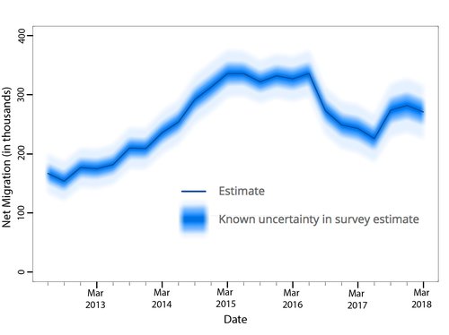
In a second set of studies, we carried out an evaluation of different methods of visualisation of uncertainty around time series estimates, and developed open-source software to enable these visualisations to be produced easily. We worked closely with the Office for National Statistics and an expert user base for migration statistics (which included members of the civil service, journalists, academics and members of think tanks).
We investigated the representation of quantified uncertainties around two types of data – trends in UK net migration over time, and trends in UK unemployment over time – to investigate the generalisability of any results. We tested 4 different potential types of visualisation of 95% confidence intervals on audience comprehension and trust: a simple block of colour, like an extended 'error bar' around the central trend line; a density plot or 'fuzzy plot' that shows the actual likelihood distribution of the data by colour density; a 'fan chart' that shows 95%, 60% and 30% confidence intervals as bands of different colours, as used by the Bank of England; and a 'fuzzy fan chart' which was a fan chart with fuzzy boundaries between the bands.
A short summary of our findings from these studies are that:
This library is designed to work with Jupyter notebooks - you can see an example of the workflow of how to use it here: https://nbviewer.jupyter.org/github/WintonCentre/python-fuzzy-plots/blob/master/examples/unemployment_example.ipynb
You can read our full report on that work here: https://doi.org/10.5281/zenodo.10790825.
This work was funded by a grant from the M2D (Models to Decisions) network.
© 2026 University of Cambridge