Does air pollution kill 40,000 people each year in the UK?
Winton Centre for Risk and Evidence Communication
News - Does air pollution kill 40,000 people each year in the UK?
Does air pollution kill 40,000 people each year in the UK?
Air pollution is news. The Daily Mail claims that Air pollution is ‘killing 40,000 a year in the UK’ Greenpeace says 40,000 lives were cut short by air pollution in the U.K., while the Guardian reports Air pollution crisis ‘plagues’ UK, finds UN human rights expert. But where does the 40,000 figure come from, what does it mean, and is there really a ‘crisis’? I discovered that digging down to the basis for this figure required some statistical detective work, so brace yourself for some forensic details…
The number itself was rather easy to find: it comes from a 2016 report Every Breath We Take: the Lifelong Impact of Air Pollution by the Royal College of Physicians (RCP), in which they state
Each year, inhaling particulates causes around 29,000 deaths in the UK, which, on recent evidence, may rise to around 40,000 deaths when also considering nitrogen dioxide exposure
This report, it turns out, combined 29,000 ‘attributable deaths’ from PM2.5 (particulates less than 2.5 micrometers) estimated in a report by the Committee on the Medical Effects of Air Pollution (COMEAP) in 2009, and 23,500 attributable deaths from NO2 (nitrogen dioxide, for which diesel engines are particularly blamed) from a report from the Department of Environment, Food and Rural Affairs (DEFRA) in 2015. Naively adding these two numbers comes to 29,000 + 23,500 = 52,500. Not 40,000.
But COMEAP said in 2015 that “adding the results, would give an overestimate of the combined effects of the two pollutants”, as studies show that the combined effect is not that much greater than either alone. Since COMEAP are still carrying out their analysis of the degree of overlap, the RCP report had to make a judgement call and simply declared “this report adopts a combined estimate of around 40,000 deaths annually”, possibly because 40,000 is a nice round figure that lies roughly half way between 29,000 and 52,500. (We note that DEFRA assumed the overlap was up to a third of the NO2 deaths, and so quoted a combined range of 44,750–52,500.)
But I mean absolutely no criticism of this guess of 40,000, as the underlying uncertainties might not warrant much more detailed analysis.
Those underlying uncertainties became clear when trying to find out where COMEAP and DEFRA got their figures from. It turned out to require some detective work — and I’m going to focus on the story of the particulate deaths, and leave nitrogen dioxide till the end for clarity.
In a 2010 report, COMEAP provides a lengthy derivation of the ‘attributable deaths’ estimated for 2008, and explain the intricacies of forecasting what the benefit might be of reducing particulates.
But in fact it’s easy to get to a rough figure.
COMEAP assume a relative risk of 1.06 per increase of 10 ‘micrograms of PM2.5 per cubic meter ’ (from now on this clumsy unit is shortened to mPM). In plain English, this means that the average risk of dying each year is estimated to increase by 6% for every extra 10 mPM you’re inhaling— more formally, this is known as a ‘hazard ratio’. (We’ll come back to this assumption of a relative risk of 1.06 later.)
The average exposure to man-made PM2.5 is around 9 mPM in the UK, so on average, mortality risk is increased by around 5%, or equivalently around 5% of all deaths are associated with PM2.5. There are 600,000 deaths a year in the UK, and 5% of 600,000 is 30,000 deaths.
Which is not bad for a back-of-envelope calculation, considering COMEAP’s actual estimate after a vast amount of modelling is 28,861 attributable deaths.
Now, if you remember, this 29,000 ‘attributable deaths’ is based directly on the assumption of 1.06 as the relative risk associated with increased PM2.5 exposure. But where does this 1.06 come from, and how reliable is it? We have to dig down a further level.
There are many studies that have attempted to relate mortality to particulate pollution: COMEAP 2009 discuss these in great detail, but base their main conclusions on a 2002 report by Pope and colleagues, which examined around 500,000 adults linked to area-level exposure data across the US and followed up for around 15 years to see whether they died or not. They estimated a 6% increase in annual mortality risk per 10 mPM (i.e. a relative risk of 1.06), adjusted for age, sex, race, smoking, education, and so on.
COMEAP emphasise the limitations of even this large study. Can differences in mortality really be attributed to air pollution, especially when the actual exposure of each individual is not known? COMEAP suspect other factors could be at work, producing so-called ‘residual confounding’: it is notable that socio-economic status is not recorded, and this could be related to both particulate exposure and mortality. COMEAP’s concerns are reflected in their assessments of uncertainty discussed below.
The 6% increase is backed up by a more recent study by Pope of 211 US counties, in which the change in life-expectancy between 1980 and 2000 is correlated with the change in PM2.5, adjusted for other factors. Pope estimated that life expectancy is increased by 0.61 +/- 0.20 years per 10 mPM reduction in exposure, which is broadly what we would expect had a relative risk of 1.06 per 10 mPM applied throughout each lifetime. But of course the same problems could apply to both studies.
So far, you might have been rather reassured about the reliability of the figures quoted in the press, but it’s when you look at the uncertainty around them that things get a bit more interesting.
COMEAP repeatedly emphasise the uncertainties in their assessment. Pope 2002 provide a confidence interval of 2% to 11% around the central 6% estimate for the relative risk, but COMEAP consider this purely ‘statistical’ uncertainty as inadequate due to the inevitable limitations of the study.
As a good example of the limitations, in the 2002 study the entire range of particulate levels was only 7 to 30 mPM. If you’re interested in pollution around the world you have to consider particulate levels both below and above this range. COMEAP point out, for example, that 60% of the estimated harm in the UK is estimated to occur at levels less than 7 mPM, and yet the US data provide no direct evidence of harm at this level.
COMEAP decided the confidence interval needed did not adequately reflect these additional uncertainties and used an interesting method, elicitation of expert judgement, to create a ‘plausibility distribution’. This resulted in a substantial widening of the original interval of 2% to 12% to one based on expert subjective assessment that ran all the way from 0% (i.e. no effect of particulates) to 15%. This was considered to have 95% plausibility, but COMEAP declared that a range of 1% to 12% represented an interval with 75% plausibility and should be used for sensitivity analysis.
To get back to some plain English, comparing this ‘1% to 12%’ interval with the basic estimate of 6%, means that COMEAP suggest the true effect could be from a sixth to double the estimated effects.
For example, although their main estimate is of around 29,000 attributable deaths, the figure could actually be between 5,000 to 60,000. And there’s a 1 in 4 chance that the effect is outside even this wide range (note that this is roughly the odds that had been given to Donald Trump winning the 2016 US Presidential election.) It’s also notable that the World Health Organisation [previous link now broken], using a different methodology, estimate only 16,000 attributable deaths in the UK from air pollution, considerably less than COMEAP’s central figure.
But that’s not all. Even if you accept 29,000 as a ‘best guess’, does that actually mean that 29,000 people are killed by particulate pollution every year, as claimed in some media stories? Well, no.
The crucial issue, repeatedly emphasised by COMEAP, is that we cannot identify these 29,000 as individuals– there are no recorded deaths to count, as nobody has ‘pollution’ on their death certificate as the cause of death. They state that:
Given this complexity, it is not plausible to think of the figure of ‘attributable’ deaths as enumerating an actual group of individuals whose death is attributable to air pollution alone, i.e. the victims of outdoor air pollution.
Such a number may be suitable for comparing the overall health burden of air pollution with things such as alcohol (22,000 attributable deaths in England) or smoking (80,000 in England), but it may wrongly suggest that people drop dead from pollution, just as they used to back in the days of London smogs. In contrast, air pollution tends to make existing illnesses worse, and COMEAP say that the actual number of people whose death is brought forward by pollution is likely to be much bigger than 29,000, and suggest it is better to say the estimated harm is “equivalent to 29,000 deaths”.
They suggest it would be even better, although not so memorable, to focus on the estimate that 340,000 ‘years of life’ are lost each year through particulate pollution. There are different ways of allocating all these life-years lost, some shown in Table 1 below, including COMEAP’s recommended intervals.
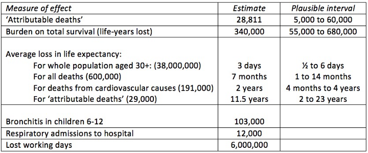
When the 340,000 life-years lost is spread over the whole adult population of 38,000,000, it’s only 3 days a year each, which does not sound much. Or we can say that all deaths are brought forward by an average of 7 months. But air pollution mainly influences cardiovascular (CV) health, and so it is perhaps more realistic to say that 190,000 CV deaths are brought forward an average of 2 years.
As shown in the Table, COMEAP also provide many other metrics for the estimated annual impact of PM 2.5, for example 103,000 cases of bronchitis in children aged 6–12, and 6 million working days lost.
None of these numbers are the ‘correct’ way of summarising the impact of a chronic hazard that tends to affect people who already have an illness, and the main conclusion is that many more than 29,000 individuals are affected.
So far we’ve just looked at official sources and their efforts to explain the health burden. But there are some more imaginative ways of communicating impacts of pollution, although the numbers will necessarily be more speculative.
For a start, we can make comparisons with other aspects of lifestyle and environment by going back to the relative risk estimate of 1.06 per 10 mPM. This is very roughly, pro-rata, like an extra hour watching TV, being another 3Kg overweight, or having an extra drink.
We can also translate any relative risk into ‘cigarette equivalents’, based on a relative risk of around 2 for smoking 20 a day, which pro-rata works out at around 1.04 per cigarette per day. Note that this has nothing to do with the particulates coming off cigarettes, but is simply an analogy with the overall harm of smoking.
We can go even further and translate chronic harm into a notional time taken off your life for each day spent exposed to pollution: for example a death brought forward by 7 months, when averaged over 50 years of adult life, is equivalent to losing just over 15 minutes off each day: this might be considered the estimated average effect of particulate pollution on the adult population of the UK.
But a problem arises in choosing a reasonable baseline from which to measure the harms of particulate exposure — no one is exposed to ‘zero’, as we can’t stop all particulates as some come from natural processes. COMEAP consider around 1.5 mPM as not man-made, while the cleanest cities in the world in the WHO database have average annual levels around 2 mPM, say for Kiruna in the far north of Sweden. We could also choose a pragmatic baseline of 7 — the annual mean level of dispersed, mainly low-rise cities such as Salt Lake City.
Taking a rather conservative approach, we can express the harm relative to a baseline of 10, the WHO target, which is considerably more stringent than EU targets: in Table 2 we show the latest data on annual mean PM2.5 for cities from the latest WHO database of ground-station measurements.
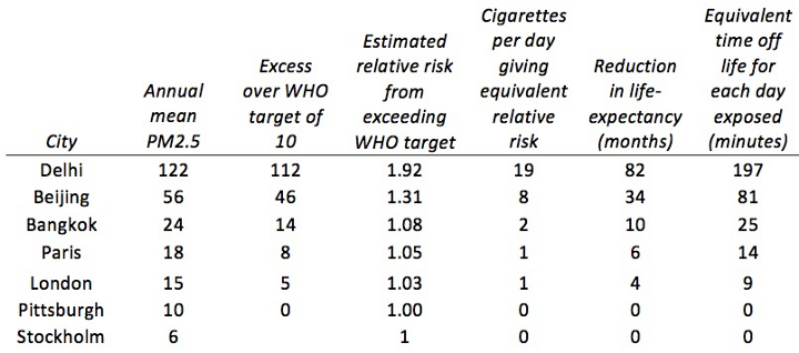
So if we are prepared to extrapolate up to high-levels of PM2.5, long-term exposure to Delhi’s air is roughly equivalent to smoking 20 cigarettes a day, and will reduce life expectancy of inhabitants by around 7 years, equivalent to losing around 3 hours life a day.
It is important to note that these effects are all gross averages — there is huge variability in exposure from day-to-day, from different areas in any city, and in the vulnerability of particular individuals due to pre-existing illnesses. There is also, as we have seen, huge uncertainty about these estimates.
So, that’s the rather long-winded story of particulate pollution statistics — what about the other half of the story?
Luckily, I don’t need to repeat the whole process for nitrogen dioxide, as the attributable deaths from exposure to that are derived in a similar way. On advice from COMEAP, DEFRA used a relative risk of 1.025 per 10 μg/m³ exposure to NO2, with a range of 1.01 to 1.04. and so estimated 23,500 attributable deaths, with an uncertainty interval of 9,500 to 38,000.
Of course, all the same caveats about ‘what that really means’ apply.
So, now we know where at least one of the popular media statistics on air pollution comes from — is it true that there is a ‘crisis’ in air pollution in the UK?
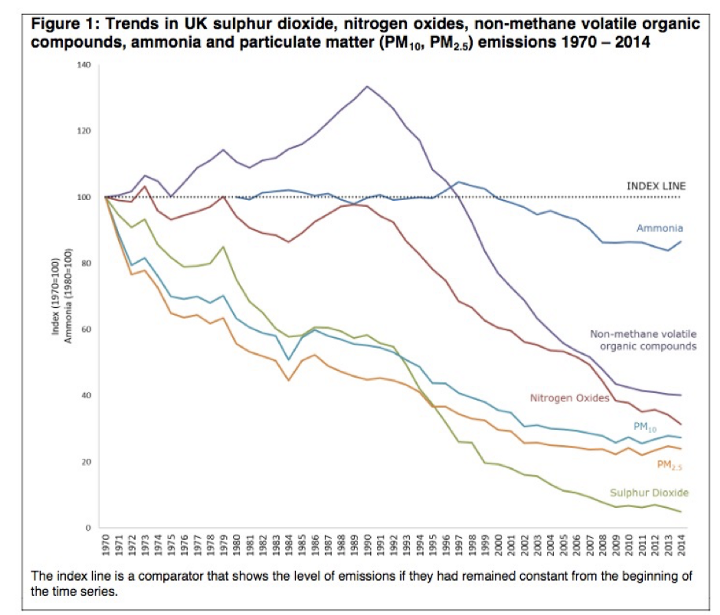
Fine particulates and nitrogen oxides have been falling steadily for decades, and are about a quarter of what they were in 1970.
So the ‘crisis’ in the UK is not because pollution is getting worse, but because there is more known about the potential harms, particularly from nitrogen oxides. But the UK is not representative of the rest of the world: many rapidly growing cities have experienced dramatically rising pollution levels.
There are huge uncertainties surrounding all the measures of impacts of air pollution, with inadequate knowledge replaced by substantial doses of expert judgement. These uncertainties should be better reflected in the public debates.
In addition, the situation in the UK is not what we would usually think of as a ‘crisis’. It can still be good to seek improvements in air quality, but only provided these are based on a careful analysis of the costs per life-year saved.
© 2026 University of Cambridge