Covid-19: Glossary of Terms & Common Confusions
Winton Centre for Risk and Evidence Communication
Covid-19: Glossary of Terms & Common Confusions
Are you struggling to make sense of the Covid-19 jargon? Or are you looking for clear definitions of key concepts as you explore the facts and figures more deeply? Well, our glossary is here to help.
We've assembled explanations of the most important bits of statistical and scientific jargon you might encounter in the news, to help you sift the evidence from the rhetoric.
Have we missed something? Email ilan.goodman@maths.cam.ac.uk and we'll add it.

Antigen or PCR tests are used to tell if someone is infected with the virus at the time of the test.
A swab is brushed deep inside the nose and around back of the mouth near the tonsils. The swab is then processed using the PCR technique. That means if any fragments of Sars-Cov-2 genetic material are present on the swab, they will be mutliplied thousands of times. They can then be easily detected (or not) with a chemical test.
They have a very high 'positive predictive value', which means that if you get a positive result on one of these tests, you can be very confident that you do indeed have the virus. The number of daily confirmed cases is the key metric used to track whether the virus is spreading, or declining in number.
Antibody tests are used to tell if someone has had the virus in the past - usually at least 2 weeks before the test.
These tests use a blood sample to detect antibodies that our immune system generates in response to SARS-Cov-2. Those who have contracted the virus and have recovered are likely to be immune from repeat infection for a substantial period of time. This test provides a way to estimate how many people in a population have had the virus overall.

This refers to the percentage of those who have tested positive for covid who have then died.
Of course, the number of people being tested changes dramatically over time. Early on in the pandemic lots of people were contracting the virus and not being tested, but now many, many more are being tested. That means this measure can vary a lot over time without telling us anything very clear about the underlying mortality rate.
COVID-19 is the name of the disease caused by the virus. It's a simple contraction of 'Coronavirus Disease 2019'.
SARS-Cov-2 is the name of the the virus itself, as distinct from the disease it causes. And why '2'? Well, SARS-Cov-1 was responsible for the SARS outbreak in 2003.
Coronavirus technically refers to the family of viruses to which this particular virus belongs. Under the microscope, these viruses look like they are surrounded by a crown or “corona” of thorns. Of course, in everyday conversation we often use 'coronavirus' to mean Sars-Cov-2 specifically, so watch out.
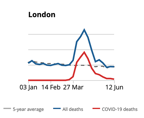
Even when we are not in a pandemic, we expect a certain number of people to die every day. The number dying over and above what we would normally expect are 'excess deaths'. It's a really crucial piece of evidence to understand the overall impact of the pandemic.
For example, in the UK between 2013-2019 an average of around 10,000 people died in the week of May 16th-22nd. But in 2020 around 12,300 died in that week - so the number of excess deaths was around 2,300.
Excess deaths includes people who have died from Covid-19, but also includes people who may have died from other causes which are indirectly related to the pandemic. For example, some people may have died because of the reduced availability of some normal medical services. So the number of 'excess deaths' serves as a measure of the overall impact of covid-19.

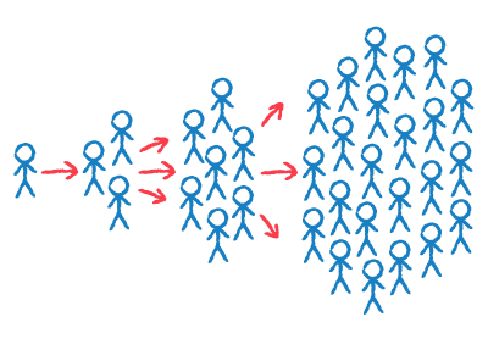
When seeing the number of people contracting COVID-19 more and more rapidly, a curve like the one above can be seen. The number of people in the beginning very low starts early to increase faster and faster till it reaches a “saturation point”.
This is called exponential growth that shows a “double” or even higher increase of the COVID-19 cases between each timeframe.
E.g. between the first week and the second of March an increase of 10 people dying from COVID-19, while between the second and the third week 100 (10x10) and between the third and the fourth one 1.000 (10x10x10).

When a high enough percentage of people are immune to covid-19, it means the disease can no longer be transmitted - that's when we achieve 'herd immunity'. It's the point where the 'herd' or population as a whole is immune - even if not every individual is immune.
People can develop immunity by having the disease and recovering, or by being vaccinated. For Covid-19, around 60-70% of the population would need to be immune to achieve herd immunity. The more infectious a disease, the higher the percentage needs to be - for example measles requires about 95% of the population to be immune before herd immunity is reached.
As of June 2020 evidence suggested between 4% and 7% of the UK population had been infected with Covid-19 (the ONS updates this estimate regularly). Estimates for other European countries have been broadly similar, so we are very far from achieving herd immunity - a widely available vaccine is our best hope for this.

This is the percentage of people who die after contracting Covid-19. It tells us the risk of dying for those who get it - in other words, how deadly it is.
The current best estimates for the Infection Fatality Rate are between 0.6% and 1% - meaning between 6 and 10 in every 1000 people who contract the virus will die (Nature, June 2020).
In theory it's easy to work out - it's the total number of people who have died from the virus divided by the total number who have had the virus. In practice, it's very difficult to know the exact number of people who have had the virus. That's because some people don't get any symptoms (so they don't know they've had it) and many others don't get tested.
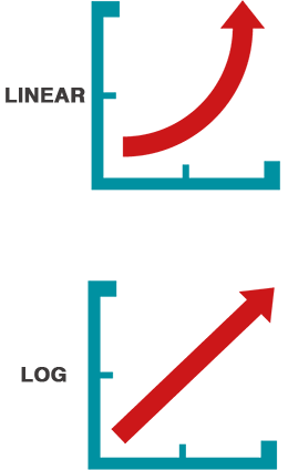
If you look up the vertical axis of most graphs, you would normally see that each notch increases by a fixed amount - for example 5-10-15-20. Each interval represents the same number of cases - 5 in this example. That's a linear scale.
Log scales are different. Each notch up the axis will increase by a factor. For example, for a factor of 10, the labels would be 1-10-100-1000-10,000 etc. Here each interval represents a different number of cases. The increase between 1 and 10 is 9, but the next interval (between 10 and 100) is 90.
Log scales become very useful when conveying numbers of infections or numbers of deaths from coronavirus. Why? Because in the early stages of an epidemic numbers increase very, very rapidly. So if 1 infected person infects 3 others, 10 people infected on day 1 could turn into 30 on day 2, 90 on day 3...all the way to 7290 all within just one week! These kinds of exponentially increasing numbers are tricky to represent on a linear graph.
Log scales have other useful properties. An exponential increase on a linear graph looks like a very steep upwards curve - but appears as a straight line on a log scale (see the images to the left). The gradient of the straight line tells you about the rate of increase.

This refers to the percentage of the whole population who have died from covid-19.
For example, as of June 5th 2020 around 0.08% of the population of England and Wales had died from covid-19.
The Population Fatality Rate can also be interpreted as telling us the risk of dying from COVID-19, among people who do not currently have it. Note the difference between that and the Infection Fatality Rate, which tells us the risk of dying from COVID-19, among people who get it.
It's most useful to look at the Population Fatality Rate for specific sub-groups. For example, up until May 1st in the UK, 0.02% of 45-64 year olds had died from covid-19 , but the rate for 75-90 year olds was much, much higher at 0.39%. Read David Spiegelhalter's analysis of the numbers here.
R is the 'reproduction number'. It's the average number of new infections caused by one infected person. So, if 100 people with covid-19 in the population passed it on to 300 other people, then the overall R would be 3.
If the R is above 1, this means the number of people infected will grow very rapidly. If it is below 1, then the infection will decline and will eventually die out.
You may also have come across the term R0. Technically, that refers to the R number right at the beginning of an outbreak. The "0" refers to the assumption that there is 'zero' immunity in the population - as in the early stages of an epidemic, no one has been exposed to the virus before so there is no immunity.

Age is the most important risk factor by a long, long way. It's difficult to overstate just how significant it is: of those who have died from Covid-19 in the UK, 88% were over 65, and only 2% were under 50.
Ethnicity - In the UK, ethnic minorities are at a higher risk of dying from Covid-19. For example, black people make up 3% of the population, but they account for around 6% of coronavirus deaths in England and Wales. After adjusting for age it has been calculated that black people are four times more likely to die from coronavirus than white people.
Sex - Men have a slightly higher risk of dying than women. Of those who have so far died from Covid-19 in England and Wales 57% were men and 43% women.
This Guardian article offers more details and visualisations of the data.
© 2026 University of Cambridge