Communicating personal risk from COVID-19: advice from our studies
Winton Centre for Risk and Evidence Communication
Communicating personal risk from COVID-19: advice from our studies
As you'd expect, we at the Winton Centre have been busy working on the best way to communicate what risk COVID-19 poses to individuals.
When a new threat emerges, such as that presented by the Sars-CoV-2 virus that causes COVID-19, it is very difficult for people to assess the risk it poses to them personally. They need information about how the disease might affect them, if they were to catch it, based on their age and health etc.
Part of the problem has been understanding the new disease, and what factors really do affect a person’s chance of being severely ill or dying from it. But now there is data from many countries which allows researchers to produce mathematical models and personalised calculators to show who is more at risk.
Risks from COVID-19 fall into one of the more difficult areas to communicate: the thought of the disease can provoke strong emotion (or ‘dread’) which is known to affect risk perceptions; for many people the magnitude of the risk is low (less than 0.1% chance of dying from the disease even if you catch it) making the numbers difficult to comprehend; but with a very wide variation, meaning that it is difficult to represent the range of risks on a single, linear scale. It is well known that even relatively subtle changes in methods of communication can have profound effects on how people perceive risks and so we've been carrying out careful empirical work and qualitative work with members of the public and with healthcare professionals. Here we set out some guidelines for communicators based on our work:
Communication messages lie on a continuum from a purely persuasive design (e.g. many public health messages) where the desired outcome is behavioural change; to purely informative (e.g. informed consent processes) where the outcome of interest is objective comprehension.
Many trying to communicate the risk from COVID-19 might be aiming for some level of behavioural change (people adopting either more or fewer preventative actions), which might mean, for instance, placing an individual into a risk band (e.g. ‘high risk’) with tailored behavioural advice. Others may be aiming to be as neutral as possible, allowing individual interpretation of the risk, which will naturally vary between individuals.
The first approach communicates less information to the audience and requires less from them, so may be preferred by some, whilst others may find its persuasive intent less trustworthy.
The second approach avoids some practical difficulties. For example, the same additional absolute risk of death would present a very different prospect to, say, a 9-year-old and a 90-year-old because of their different background levels of risk, making automated categorisation of risks difficult.
In our work we asked people in the UK whether the aim of personal risk communication about COVID-19 should be as neutral as possible ‘just to ‘inform people’ or whether the aim should be to ‘persuade’ people in order to change their behaviour, 63% of participants (n=2500) chose a mark on the Likert scale above the half-way point - towards the tool being ‘persuasive’. When this subset of participants were asked in which direction they wanted it to persuade people, 61% said that ‘it should try to make people be more cautious by showing that even if the risk is low to them, they can spread it to others’.
The 'risk from COVID-19' breaks down into two components: the risk of catching it, and then the risk of the consequences of catching it. The risk of catching it is very much influenced by the prevalence of the virus in the local area at the given time and an individual's behaviour (how many people they mix with, what precautions they take). The risk of an individual suffering a bad outcome if they catch the virus is a more stable number, associated with their risk factors (many of which are not controllable, such as age and sex). An analogy might be risk of hay fever from pollen: your chance of suffering hay fever is relatively stable, whilst the pollen count and your chance of suffering depends on local conditions plus your behaviour. Of course hay fever is not infectious so there is no 'risk to others' of an individual suffering it themselves so the messaging around the risk would be different.
The main audience for our purposes was the general public. This presents the greatest communication challenge, and means that any communication produced should then also be suitable for other contexts (e.g. use by a healthcare professional in checking a patient’s risk whilst making treatment decisions, or communicating risk to an individual patient).
Our studies involved online experiments with 5,520 people in the UK, representative of the population by age and sex; and interviews with 28 members of the public and 7 General Practitioners from England. From this work, our advice to communicators is:
Percentages appear to be the clearest format, having the smallest variance. They also make the risk seem lowest, with chances expressed as ‘x out of 100’, ‘x out of 1000’ or ‘1 in x’ conveying increasingly higher likelihoods (on the range of orders of magnitude we tested - down to 1 in 1000). In order to provide balance, then, communicators might choose to use both a percentage and a frequency with a large denominator for the main risk score. However, beware using too many numbers on a single scale or presentation format as they can become visually busy and overwhelming, which can have negative effects on comprehension due to cognitive load.
The result should not be described as ‘your risk’ as the outputs from algorithms are always a (sub)population-level result relying only on the necessarily limited amount of information inputted. We suggest using ‘Risk result’ or ‘Risk level’ as descriptions.
Positive and negative framing is known to be able to cause a difference in people’s perceptions of risks and we also found that people who had been shown the number likely to survive rather than the number likely to die found the risk less worrying and seemed lower. It was also ranked high on subjective liking when five formats were ranked by participants. However, these effects do come with a compromise in participants’ comprehension of the risks, which may have been affected by the large numbers (which frequently included long strings of ‘9’s) needed to convey the very low risks in this experiment. We would recommend using negative framing but including a single translation to the positive within the format (eg. ‘We would expect 2 in 1000 people to die… that means that 998 out of 1000 would survive’), once again with the caveat that this may decrease comprehension if there are already many numbers being presented.
Despite the difficulties of representing several orders of magnitude on the same scale, participants generally found the linear scale more easily understandable and slightly more trustworthy.
Using a linear scale generally requires cutting it at a suitable maximum point, and participants stressed the importance of explaining why that maximum point had been chosen and using a description of the type of person who would have that very highest level of risk to help them calibrate their perceptions to the numerical scale in front of them.
Colouring can affect the impact and interpretation of a scale. In this study we did not investigate these systematically. Issues of accessibility to those with visual impairments as well as the principles of good design should guide the use of colour as well as empirical testing.
An absolute risk figure (eg. ‘2% chance of dying if you catch COVID-19’) is, on its own, generally unhelpful to members of the public. The public are very unfamiliar with the absolute risks posed by COVID-19, but their estimation of the absolute risks of those individuals changed when given some contextual information.
A visual scale with a well-chosen and well-explained maximum point helps give context, but participants in these studies also found that the most useful comparators were the absolute risks faced by individuals of defined ages and risk factors covering the full range from very low risk individuals to very high risk individuals - in other words, putting numbers against a series of ‘personas’ that are their natural mental models.
Giving people context in the form of other risks that they might face was deemed slightly less helpful - probably because people don’t have a good mental perception of those risks either or because those risks were seen to be qualitatively different in important dimensions. Similarly, choosing personas that weren’t easily imagined (‘you if you didn’t have these risk factors’, or ‘an average person of this age’) were less helpful.
Out of the formats we tested, the one that we'd recommend most was:
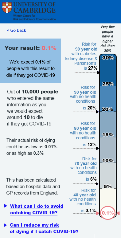
However, please note that the numbers shown on this scale are ILLUSTRATIVE ONLY and do not represent genuine data! Many participants also felt that the format should include a sentence to remind viewers about the risk posed to others by their behaviour as well as that to themselves.
A copy of our full work on this topic is currently available as a pre-print at: https://doi.org/10.1101/2020.10.05.20206961. This means that it has not yet been peer reviewed.
All mock-ups of results shown to participants in our work were hypothetical, and participants were asked to imagine receiving that result in real life. This removes both the prior beliefs that that people may have had about their own risk (making it impossible to assess the effects of those prior beliefs and potential conflict with the information being communicated), and the emotional component of receiving a result relating to one’s own mortality.
Before implementing any personalised risk communication it would be important to test the proposed format on participants receiving their real results, with appropriate ethical permissions and support in place.
Our experiments also only covered the communication of risks between 0.01% and 20%. Depending on the absolute risks being communicated (eg. whether it is ‘the risk of dying from COVID-19 if you catch the virus’ or ‘the risk of catching and then dying as a result of the virus’), the absolute risks for many people could be much lower than this (especially at times of low prevalence of the virus). Further research would be necessary to extend this work to lower percentages where different visual and numerical formats may be required.
© 2026 University of Cambridge